Angryblue, good with the birds.
Since a very early age I’ve loved two things: to read and to draw. I was brought up on a lot of mythology and legends and that fed into a love of fantasy fiction, which in turn led to a love of fantasy art. I’d spend hours looking at books about Frazetta or Brom, and at school and college I decided it would be entertaining to take double art. It was a complete waste of time, other than for a few moments we’d touch on stuff like early renaissance religious pieces, and woodcut artists like Gustav Dore, in art history.
In previous posts you’ll have seen some mention of the artwork Games Workshop uses and some praise for that, and while obviously I share a similar level of appreciation for that, it’s not the kind of art work I primarily enjoy now. Around the same age I got into the hobby, something happened to me that happens to most people in those years, and that’s starting to find oneself musically. This tied into my growing love for art and design of a particular focus. I just couldn’t argue with a lot of what I was listening too/looking at.
Take Bathory’s ‘Hammerheart’ album as a prime example to help explain it. While not as good as the album that preceded it, it was the first thing of theirs I came across. Just as engaging as the album is the cover. There’s a medieval gothic logotype scrawled across the top in their signature style, countered by a runic style album name at the bottom that references the Elder Futhark. Behind them both is a Frank Dicksee painting of a longboat being set a blaze, as a ruck of Norse Vikings try and inculcate one of their dead into Valhalla. This is a prime example; it’s everything in one package. Incredibly vitriolic metal twinned with an over the top layout design and the incredible painting of the burial rituals my mam had taught me about as a kid. This could be applied to so many of the other genres I was learning about too and for a variety of different reasons.
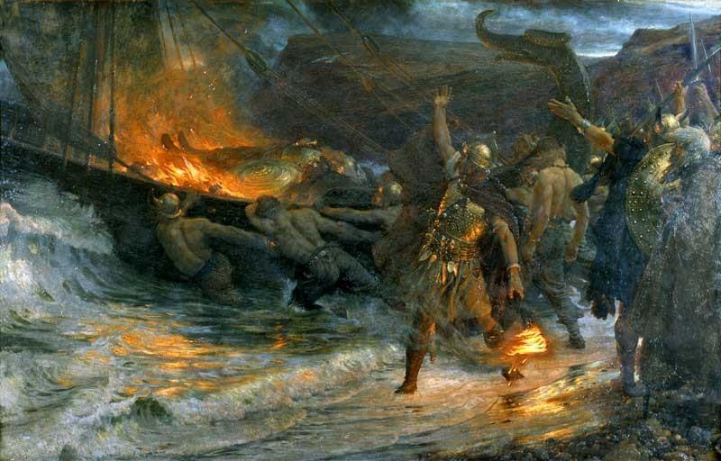
The Funeral Of A Viking by Frank Dicksee
I digress, what I’m trying to explain is that one of my favourite kinds of artwork is that of music. And in this article I’d to share a few of the illustrators working today that are killing it. This isn’t an organised list of even necessarily my top 3.
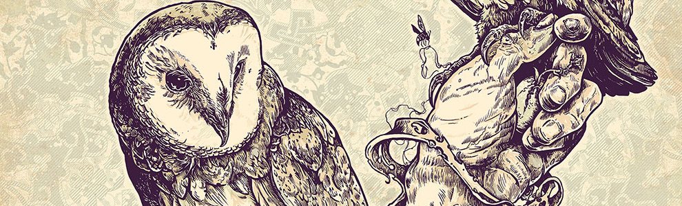
Mother Earth by Angryblue
Justin Kamerer AKA Angryblue. I first came across him while reading the brilliant I Want Your Skull blog, now defunct since the authors (Ryan August) death. I’ve never taken hallucinogens, but I reckon this would equate to the kind of awe inspiring mind fuck that could only be achieved by 2 tabs of Lsd and a bag of mushrooms all washed down with some peyote. Obviously by this point I knew plenty of illustrators and artists who worked on detail. But what struck me, and still does, with Angryblue’s work is just how perfect the attention to detail is. If you get a chance to look at his pieces online, he includes work in progress shots sometimes, which often have items like the end of a pencil in it. Using that you can pick up on just how small of a scale he’s working at. He’s packing more detail in to say an A4 scale than other artists could accomplish by inking stuff out at A2 and scaling it down. Usually I tend to enjoy most artists work at the sketch/inked stage, but that’s completely different with Angryblue. To me once I’ve got over the initial eyegasm from seeing one of his pieces fully inked, I look forward to seeing the colour ways he adds later to use it on a finished poster. I can only assume that the reason a lot of the limited number of pastel colours he picks are immediately more enriched is by the complexity of the illustration. I’m sure there are illustrators that predate him doing the same thing, but for me he’s carved out this perfect style that nails it over and over again.
John Dyer Baizley’s original piece for Yellow & Green by Baroness
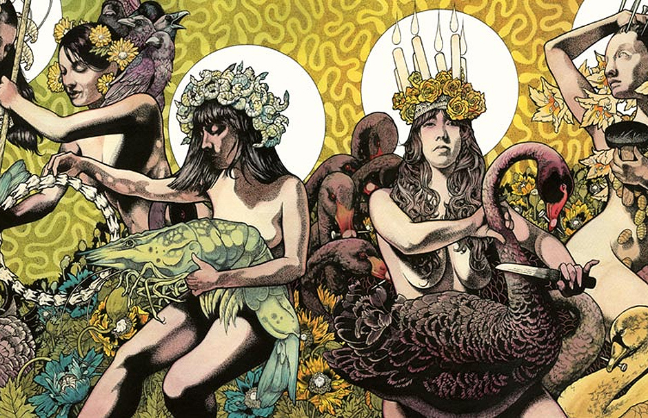
Next up is this dude you are probably all familiar with, John Baizley. As with a whole raft of artists, I’ll see a nice record cover or poster and make a mental note to check back on which artist created it at a later date and absorb a lot of their work then. Upon doing so I often find out it’s the same artist as a lot of my other mental memos, and John Baizley was no exception to this. I think I picked up Baroness’s Red Album early 2008. Obviously I had to find out where the cover art was from and finding out it was a member of the band I looked him up. There were about six or seven things I’d made a note to check up on; Pig Destroyer’s ‘Phantom Limb’ and Darkest Hour’s ‘Deliver Us album covers for example. With Baizley, what I find so captivating is actually made up of a number of components, which when combined, are just as awe inspiring as they are separately. First off is his subject matter, esoteric and psychedelic in equal measure, it makes for a strong symbolic feel to what you’re seeing. Add to that the composition of the piece, with no open space left unintentionally and balanced, so that no interesting part of the image is lost to one daunting focal point. Then there’s the application of stipple shading, it’s minimal but perfectly deployed to give the right feeling of depth without dominating the piece. Finally add in his use of colour, which in some pieces is so varied it feel like it would look like the pantone chart was rearranged by the guy who directs the Scissor Sisters videos. Instead they all work perfectly together, often to compliment the shading but sometimes in marbled gradients that work all on their own. All of it these things together make for a basically untouchable stoner vibe and, yet some how works perfectly on heavier releases at the same time.
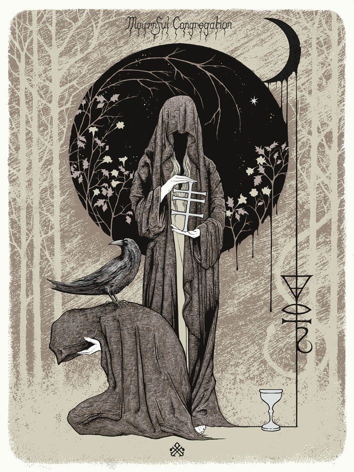
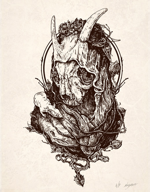
A piece for doom masters Mournful Congregation by Glyn Smith
So for now, I’m just going to bring one more illustrator to your attention and that is Glyn Smith. I’ve only really started following his stuff over the last couple of years, despite having seen the odd piece of work by him before. But suffice to say, he’s right up there for me, to the point where I made a pilgrimage to London just to see one of his pieces in the flesh at the Black Sabbath art show. The thing that ticks so many boxes for me with Smith’s work is mainly based on subject matter, and the heavy use of folkloric aspects mixed with this uncanny eye for borders. This might seem like an odd sort of statement, but beyond the obviously impressive look and detail of his work, there’s a really interesting use of borders as part of the composition as a whole, especially on pieces like the Zozobra cover he did recently. It’s like the perfectly subtle use of spaces filled with nothing at all that just frame key elements of the illustration perfectly. Like a lot of my favorite illustrators in the field he works in limited colours, often working in one or two pastel shades beyond the black and white to highlight certain elements of the image. Then alongside it all there’s this wonderfully deep use of shading, which combined with the composition and symbolic style just makes his designs stand out even more.
Below you’ll find links to places you can view more work by each illustrator. If people are into these artists I’ll happily add even more suggestions in a later article.
Angryblue: www.angryblue.com
John Baizley: www.aperfectmonster.com
Glyn Smith: www.stagandserpent.tumblr.com
Peace
Great artists. I’m always on the lookout for Baizley prints that don’t cost an arm and a leg.
If you live anywhere near London I can recommend the Flood Gallery. Seems to have Baizleys, Becketts, Blues, Koziks ect. There’s also the Goodall Gallery in Manchester though a lot of it’s prints and rock posters aren’t by quite as contemporary artists.