I recently wrote an article for The Black Library Weekender I attended last weekend and gave it a very favourable review. It was a shining example of how an event should and could be handled by the higher up’s of BL. Great staff, great experience, great weekend. As I mentioned in that review the centrepiece of the weekend was the new addition to The Horus Heresy, Macragge’s Honour. It’s not often that BL dip into the realm of the illustrated story these days but in the past what I’ve picked up I have enjoyed. However this is the first time they’ve delved into that particular medium for The Heresy, so when I first got wind of this I was rather excited and had greatexpectations. Ahead of the event a little bird told me about the price to expect, the creative team behind it, Dan Abnett writing and Neil Roberts handling the art and finally that it was going to be Ultramarines based. Whilst I wasn’t overly put off by the fact that the smurfs were running the show after Abnett showed how well he can handle them, I was disconcerted by the price, 85 fucking quid and the fact that Roberts was doing the artwork. The real issue though is the price and here is going to be the fulcrum upon which the scales balance.
Arriving at the weekend I had the foreknowledge that the graphic novel was going to be up for a special edition pre-release but I wasn’t sure just how many people were going to give in to the hefty pricetag. I queued up and picked up my purchases but still couldn’t make my mind up about whether or not I wanted to dish out the money for the graphic novel. At the end of the first day I picked up a copy. Somewhat excited about my days purchases I spread them across the hotel bed to look at them. I knew that Macragge’s Honour was going to be the piece I was going to look at before returning to the second day of the event. And for many of us others it would become the talking point of the weekend. I had a brief flick/scan read before arriving at the second day but then decided to avoid conversation really on the book too much and didn’t attend the panel on it as I wanted to write a review fairly untainted as anyone else would who had picked the book up from a store or ordered it online. So here’s what I found.
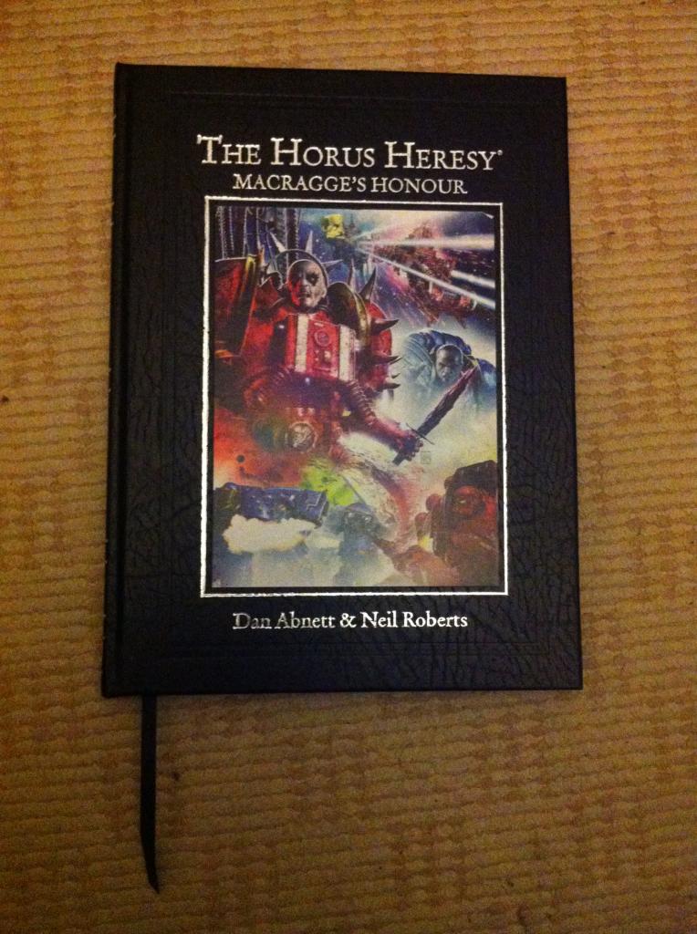
Let’s get the basics out of the way, it’s a solid 100 pages, written by canon favourite Dan Abnett, all the art carried out by Neil Roberts and lettered by Nikki Foxrobot. The story is a follow up to Know No Fear and picks up after The Battle of Calth, specifically focusing on the naval battle and pursuit of Kor Phaeron. This first edition are purely out of 350. First impressions aesthetically are fairly pleasing. It’s a leather faced hardback and has a pleasing, reassuring weight to it with its lovely silk pagemarker hanging from the bottom of the book enticingly. The print onto the cover and spine is strikingly set in silver and really does look classy and from a side profile the pages are lined with a silver foil in keeping with the print. It overall feels like more of a tome and is definitely meant to sit with the special edition leather hardbacks of Visions Of Heresy, it even has that awesome leather smell. However despite all of this it is here that I take my first offence. On the front cover is the first piece of artwork. Unlike some of the other graphic novels (e.g Inquisitor Ascendant) which feature a cover by another artist that was never going to happen with this one. It’s Neil Roberts. They say you can’t judge a book by it’s cover. In this case that’s not going to be true. It’s a bright garish piece featuring an Ultramarine and a Word Bearer. I wasn’t sure who they were but when I finished I knew and it should have been obvious to me, but it wasn’t. However, this for me encapsulates Neil Roberts work, it never looks quite right. This guy peering at me from the cover was Kor Phaeron but all I could think was “When did a young (important) Alice Cooper go through chemo?” But that’s enough on the cover let’s get inside.
The format was familiar to me, the usual intro can be found from The Horus Heresy novels setting the scene and then it moves to the Dramatis Personae, who now have little icons next to them like they’ve all set up face book profile pictures. I kind of found it pretty cool. All that there is now is to get into the story, It start’s big. Loads of colour and right into the thick of it, exactly the kind of thing you’d expect in an action film. I’d like to take a moment now to say, I’m not going to give the plot away, I won’t be telling the story and I won’t be showing any pics of the pages. Why? Well I don’t want to hand out any spoilers. So the narrative begins. It moves at a fairly fast pace as you can expect from a graphic novel. The script makes the character interaction believable from what we’ve read from the novels and it’s carried off nicely. The flow of the narrative is smooth, not awkward or clunky. However there were some moment’s where I thought there were some plot devices that were a bit too convenient. At the end of the story I was left thinking, well not a great deal has happened really. It moved quickly and covered 100 pages but it seemed a bit small scale, a skirmish almost when in one of the introductory pages it says “It is the beginning of one of the most infamous naval duels in Imperial history.” The concept just seemed at odds with the result. It was pitched as being this large scale epic motion picture style graphic novel and it definitely reached for that but I just felt like it fell short. The medium didn’t seem to highlight the depth of Abnett’s abilities as a crafter of stories. It just seemed too straight forward, like a Space Marines battle book. I’m aware that they wanted the big guns for this first release but it could have been anyone to write this story or possibly used a different story to utilise Abnett correctly. Next up is the art. Well here for me is the true downfall. I’ve always found it hard to get behind Neil Roberts. It was a moment of reluctance when I first heard he was working on it. We all know Neil Roberts from the covers of all the other Horus Heresy novels. I found many of these covers hit and miss, for example, Legion, awesome, Tales of Heresy, poor. In fact, for the most part I’ve found them fairly underwhelming and I wasn’t really sure why. In particular I looked at the cover for The Primarchs and hated it. I didn’t know why. Horus’ head just looked goofy. Something about his face I didn’t like. I asked my girlfriend “what’s up with this?” Her reply was “It looks like a shaven ballsack with a face”. I have to admit I can see what she was getting at. Whenever he’s dealt with faces on the covers something’s looked slightly wrong. It’s a strange medium that hangs somewhere between photo realism and traditional graphic novel art. This kind of rendered CGI aesthetic, everything shines too much. Unfortunately this cover art style is translated into the graphic novel. There are brief moments of cells that I enjoyed and the occasional splash piece giving some large battle scene which I thought was cool but overall it’s these bright gaudy images of in your face colour and over-rendered faces. Going back to what I was saying of Kor Phaeron, I imagined some haggard, gnarled old dude snarling, clinging onto life, bound into a suit at odds with his decrepit, despicable frame. What I got was what could have physically been any Astartes with the head of a smooth-skinned, bald transvestite. It seems chaos has been working hand in hand with Nivea and the apothecaries have been getting some work experience with the orange ladies you see in House Of Frasier. Again I consulted my girlfriend and she immediately said “I don’t like it, it looks like bad game graphics.” This time I could totally see where she was coming from. I was unimpressed again with the art, and I would have really chosen a more traditional but enjoyable art medium. I would have preferred previous artists such as Adrian Smith, Simon Coleby or my first pick Karl Richardson. All of these have contributed to works before and produced a fantastic first rate graphic novel. In particular Lone Wolves. What I don’t understand is, why fix what isn’t broken? Like most graphic novels, what I really enjoy is at the end having some exposition of the creation of the graphic novel. In particular I love seeing the art sketches. Like the rest of the medium Macragge’s Honour has this. There’s only one problem, I preferred the sketches to the finished graphic novel. The characters seemed to have more life, more expression more, well…character. It’s somewhat like if you bought the Blu-ray of Prometheus and you watched the deleted scenes and the unrevised choices. You suddenly realise how much better it could have been and that the Director simply made all the wrong choices.
So wrapping it up what did I think? The concept of producing graphic novels for The Heresy is great. It really should be pursued but for a first outing this stumbled and fell flat or me. Would I like to see themselves pick up and carry on? Yes, definitely there’s so much more potential. I feel bad saying this because Neil Roberts seems like such a decent bloke but I just don’t think that he’s meant for that medium. If I was to give the book an overall mark out of 10 I’d have to give it a 5 and most of that is made up by the presentation. Referring back to what I thought would be the pivotal question “Is it worth the 85 pounds charged for it in this format?” No, at a push 40. And if or when it does get released as a paperback how much would I say? Well I’d be hacked off if I paid more than 15 quid.

This doesn’t mean “Add 45 quid”
Nice try guys, better luck next time.
“It seems chaos has been working hand in hand with Nivea and the apothecaries have been getting some work experience with the orange ladies you see in House Of Frasier”
Absolutely superb.
I finished the book before reading this and can say that it’s a very accurate review. I dont want to hate on Neil Roberts as he’s contributed so much to warhammer 40k but the artwork overall is dissatisfying. On a positive, the ship battles look great and I would love to see him back to create void warfare scenery. It delivers on that “hollywood experiece” we were promised.
When it goes down to the smaller scales to include the characters though, it looks terrible. I would be perfectly okay with utilizing Roberts for void battles and another artist to do everything else.
Story-wise i agree that in 100 pages not much happened. It was fast paced from the begining and it gave a great feeling. Then you realize most of the high testosterone moments are void battle gargan exchanged between ships officers and only a small handful of pages which included space marines engaged in combat. The opening page gives you a list of characters but many of them appear only once (as in on only one page) and have no dialogue. They literally had the roles of extras. Those 100 pages easily flew by as if 20 and more characters utilized could have helped.
Overall I wouldnt consider this a great novel and would probably give it a 5/10 myself. It’s only that high because it was a decent first step to an established lore. If i hadn’t already purchased this I would consider buying the paperback for no more than $20. Possibly not at all, and I’m the kind of guy who buys multiple copies for collections sake.
Yep you were done, I spent 25 on this and felt cheated for days. The high point is Dan Abnett, but not Neil Roberts if they wanted to go that digital, go Clint Langley. And the sketches at the back of book are rubbish. That’s the main problem with this book is it should be a book you revisit so you can enjoy the artwork but that’s not going to happen. GW has such a fantastic background in fantasy art as well.