A while back, a message dropped in the inbox of the Corehammer Crew email. We get requests here and there, but not too many, and this one was specific to painting, so I thought I would have a crack at it. It was from a newer gamer, who wanted to achieve a green, crystal like appearance on the Shuriken Catapults on her Eldar. We had a little back and forth where I asked her to clarify what she was hoping to achieve, and I asked for a reference point. From there I knocked up a little guide and I thought it would be worth posting up here just in case anyone else wanted to achieve a similar effect. It also isn’t too bad an introduction to the push-pull glazing technique that organisations like Miniature Mentor are keen to show off.
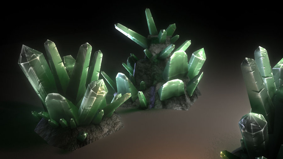
The reference image Reneé emailed over was the one above. It’s a mega cool looking green with deep red shadows and nice desaturated highlights. I struggled to find the correct colours though so turned to my man John Harrison, a loser of such magnificent proportions that he was able to nail the colour scheme straight away for me.
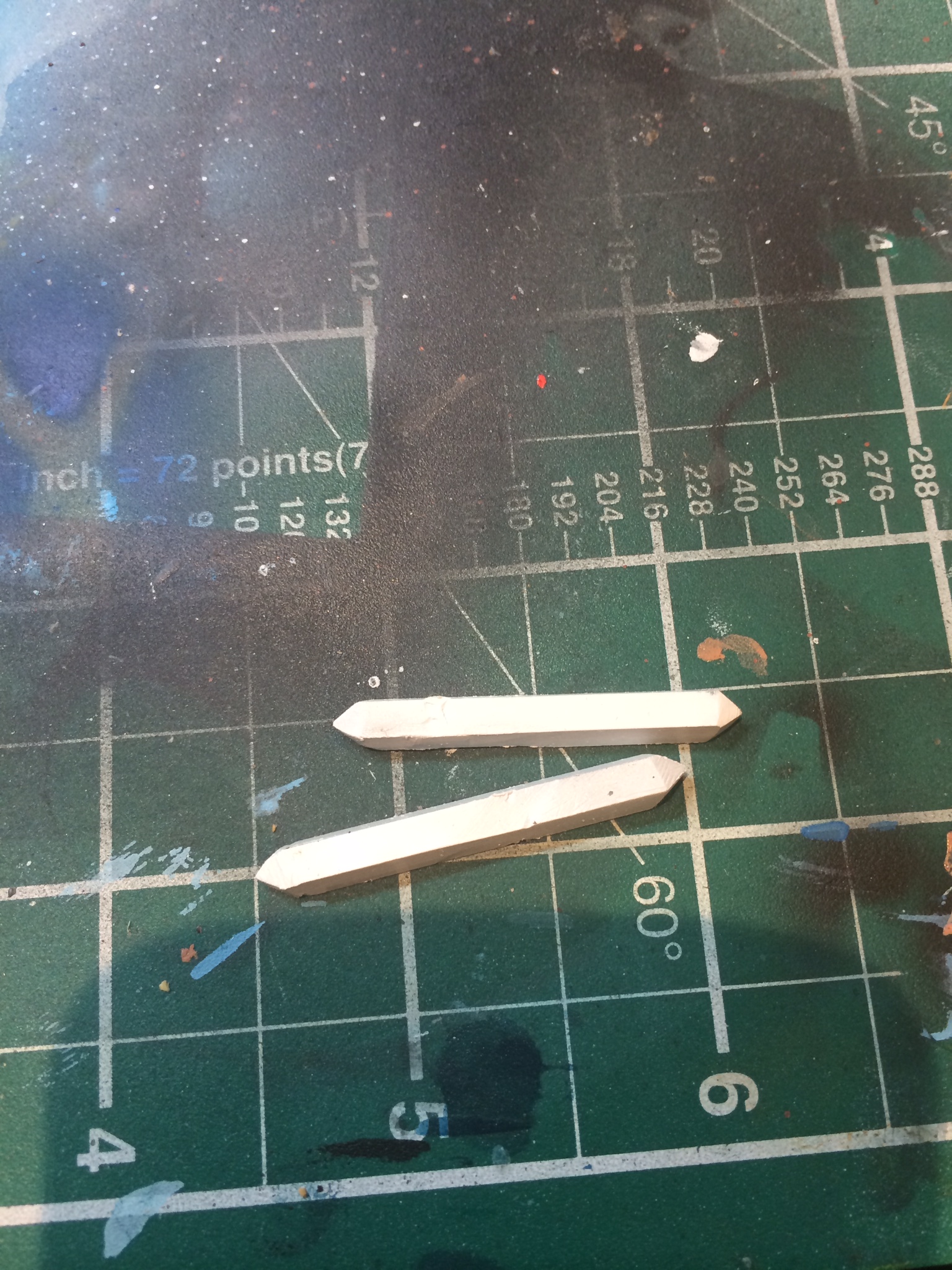
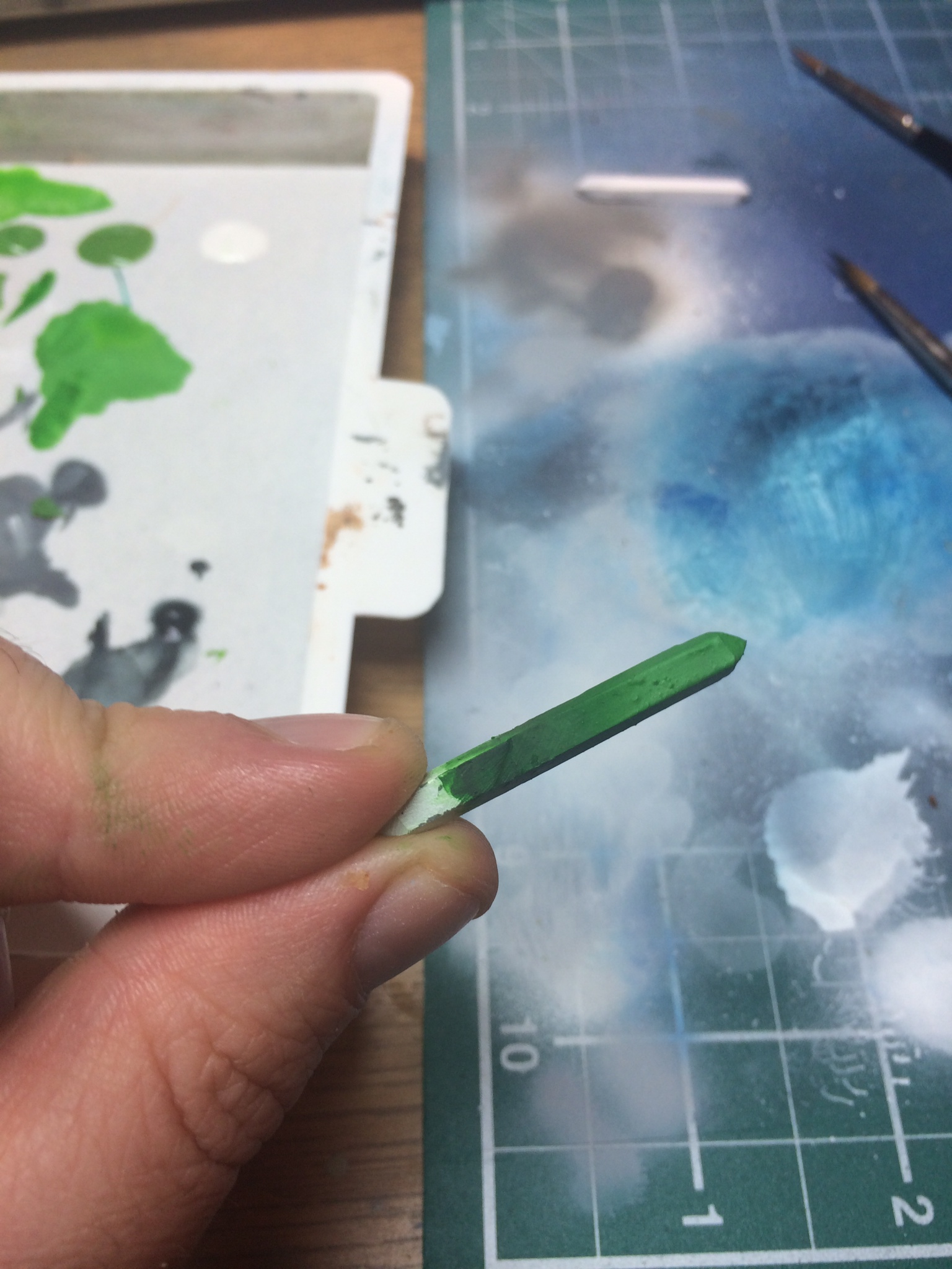
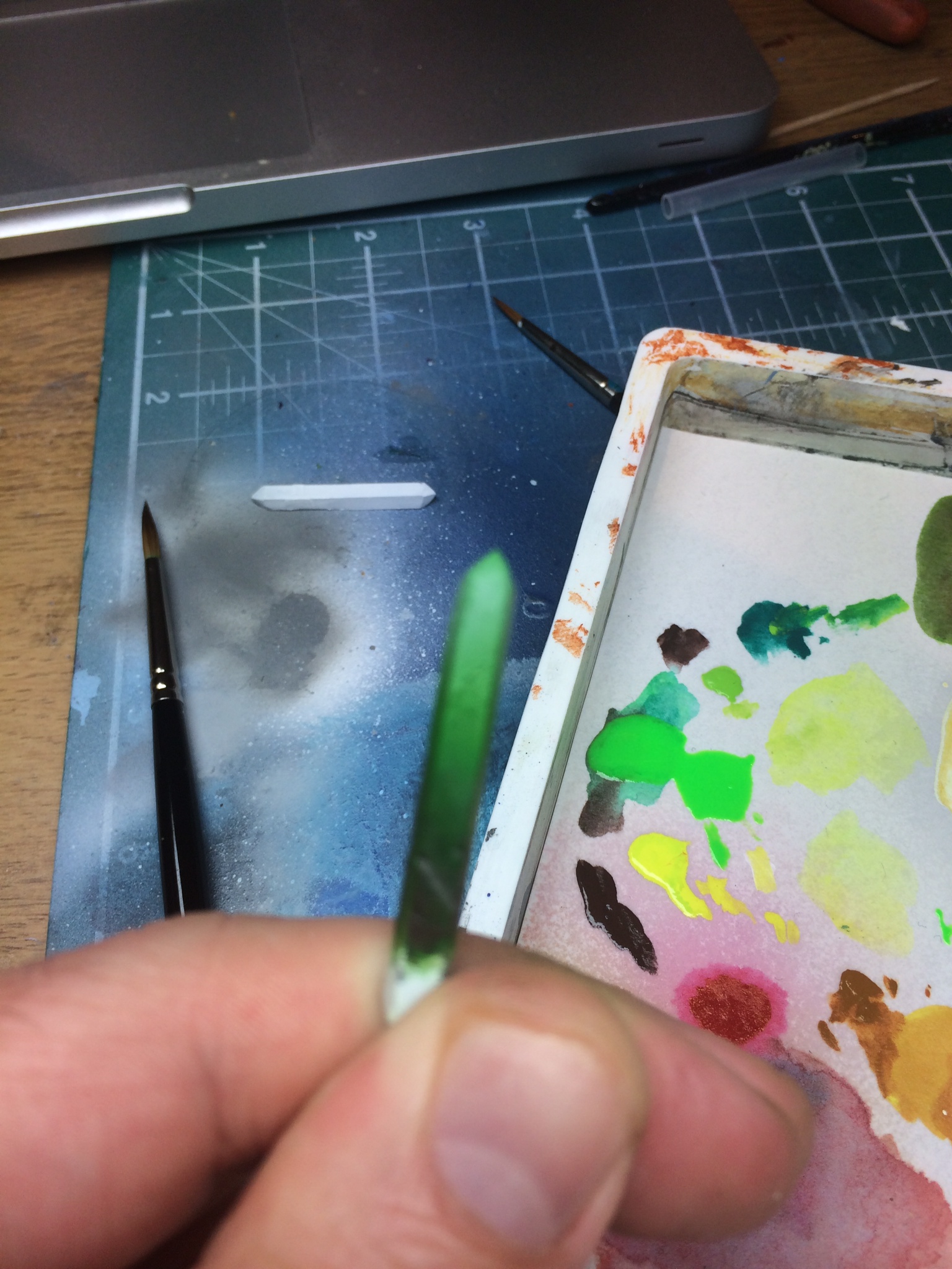
I thought I would try to recreate the crystal to offer the best example I could. So I used a chopped off bit of sprue and sharpened it to a point. I added the white primer by airbrush but everything else was hand painted with a size 03 Windsor & Newton brush.
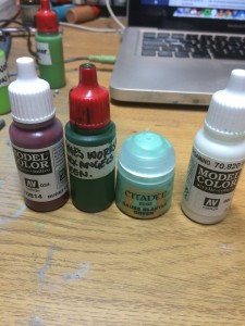
I forgot to include Space Wolves Grey, but you get the idea
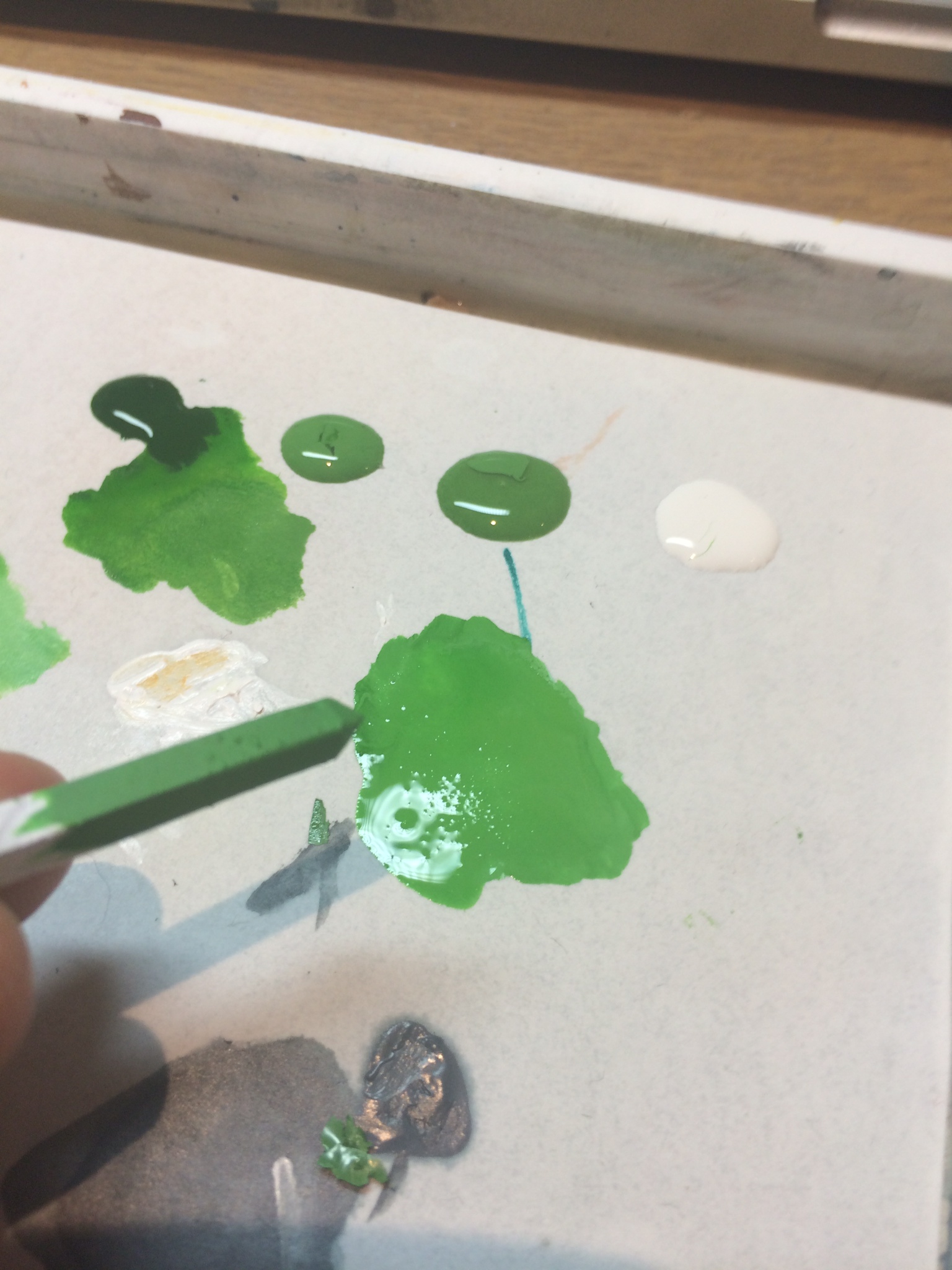
I liked the colour of the crystals Renee sent so I thought I would do my best to try and match the tone as closely as possible. To that end I used:
- Dark Angels Green / Gauss Blaster Green mixed about 1:3. This was the basecoat.
- Dark Angels Green – 1st shadow
- Dark Angels Green / Burnt Cadmium Red mixed 2:1 – second shadow
- Burnt Cadmium Red – last shadow
- Original mix / Space Wolves Grey 2:1 – 1st Highlight
- Space Wolves Grey – Final highlight
I applied the first basecoat thinned with 50% water. I can’t stress enough how important thinning your paints is. Especially to the process I’m about to outline. Two, three, four, or five thin coats is better than one thick coat. This is whats causes that chalky effect you sometimes see on minis. The technique that follows is called glazing, but not really the way GW explain glazing. It also uses something called the push/pull technique.
Once you’ve added your basecoat you want to do your shadows. Some people go shadow/highlight/shadow/highlight. I prefer to do all of the shadows, then do my highlights. Here is where you’re going to get in to the real theory of making things blend well. What you’re going to do is thin down your paints to the consistency of pic 4. Something akin to skimmed milk is what you’re aiming for, so VERY thin, like a wash. Then follow this process:
- Get some paint on your brush, then dab it on to some kitchen towel. This will remove the excess moisture, but leave in the pigment.
- Begin your brush stroke just above where you want the shadows to start.
- Brush downwards toward where you want your shadows to end.
- Remove your brush at the area of the deepest shadow.
- Allow the paint to dry (a hairdryer REALLY speeds up this process!)
- Repeat.
This is the technique you are going to use throughout the process. It is called the push/pull technique. The theory behind it is that you deposit the most paint at the point when you remove your brush. So you’re creating the blend by brushing downwards, and leaving the paint in the deepest shadow. The same is applied to the highlights. Pull your brush toward the lightest area.
It’s very important to note that you won’t see results for a long time. And of vital importance is that you stroke, allow to dry, stroke again, allow to dry. You never want to be doing brush strokes over a surface that has wet paint on. Otherwise you will end up with tide mark looking areas that are a real paint to get rid of.
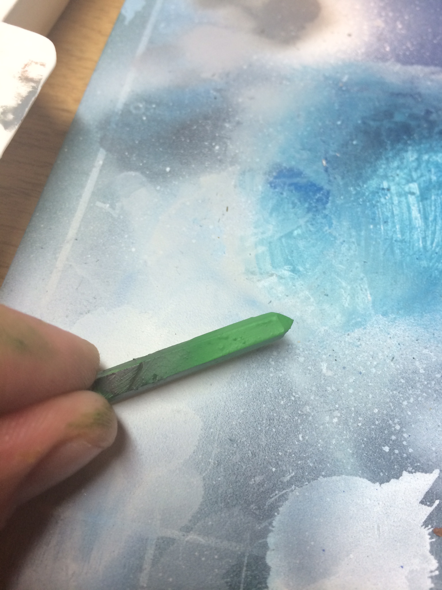
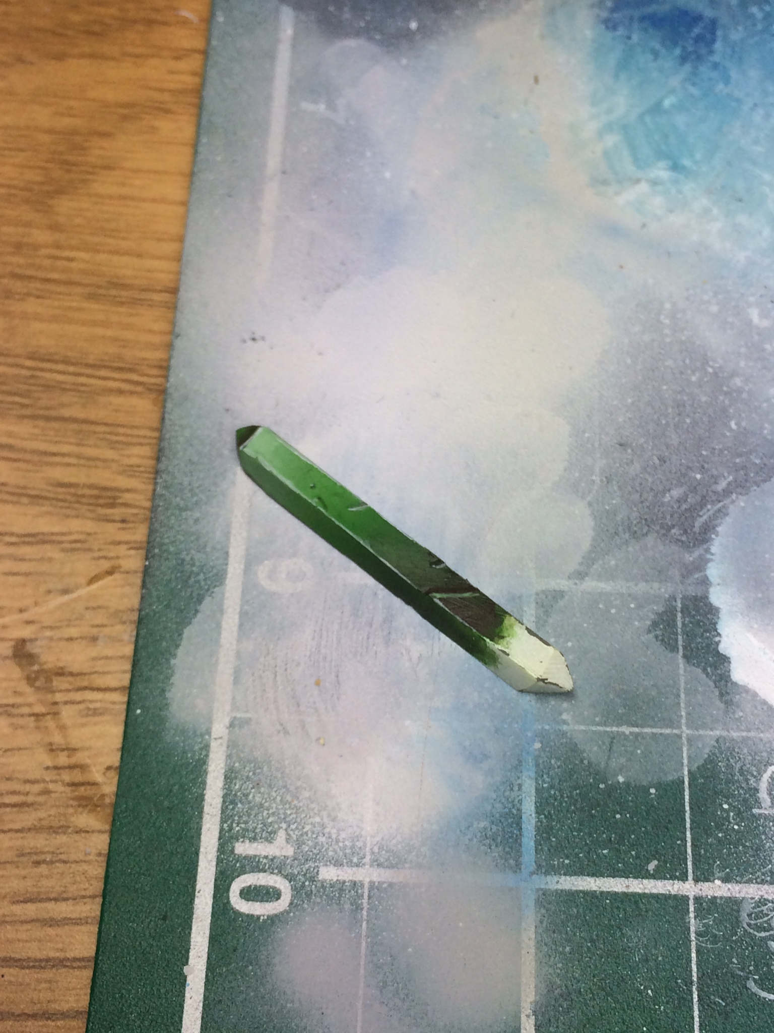
So you apply your first shadow with Dark Angels Green as mentioned in the list. It will take some time to start to see the blend. Be patient, don’t expect results after a couple of strokes. Just apply, dry, repeat and keep going. If your paints are thin enough, and you’re ensuring that you let the last coat dry before moving on to the next, you’ll nail this in no time. This is how it looks after the first shadow has been added:
The line toward the shadow is actually a ridge where I was filing it. We’ll put that to use later though and do something cool with it. Thats the first shadow done, but with crystal reflecting light almost like metal you’re going to want more contrast than this. With green being opposite red on the colour wheel, adding a little red in to your shadows will add loads of character to it. So this is going to be deeper than the original shadow. As such, you’re not going to start your brush stroke from the same position, but from a little bit further in to the shadow area. Exactly the same technique though. Here is how it looks after the second shadow:
Maybe a little tough to see but there is a bit of red in the shadows there (as there is in the source image Renee sent over too). The final shadow is much the same, but just the red on its own.
After this you’re moving on to the highlights. These are done in exactly the same way as the shadows, but moving toward the lighter areas instead. Here is the shard after the first, and then second highlights: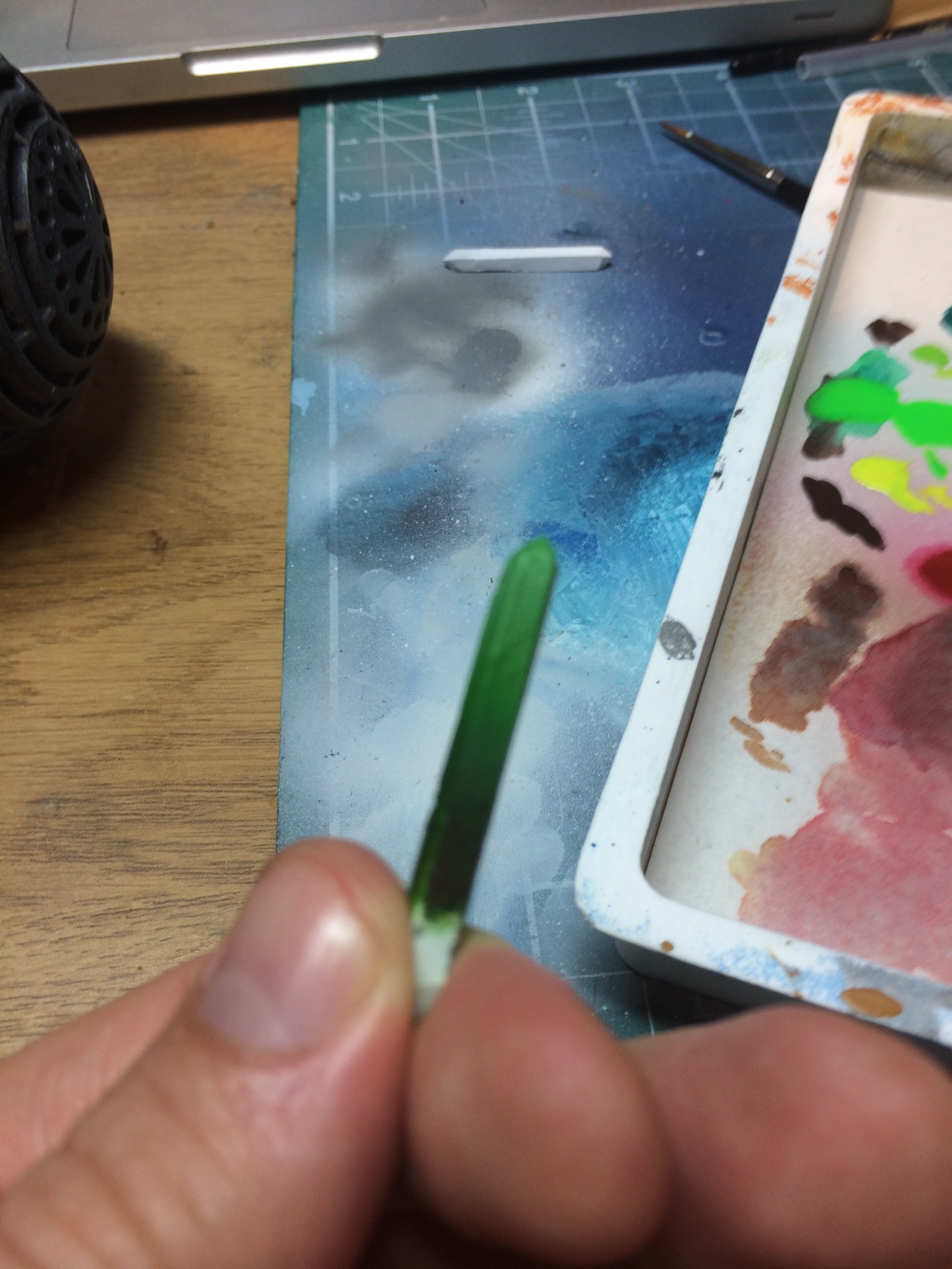
 Thats pretty much it for the highlights. however, there are some additional things you can do to make it pop. This is less relevant for the surface you’ll be applying the colour over, but it’s worth mentioning non-the-less. The pointed part needs to pop out in some way. To make that happen, you want to have a smaller version of what you’ve done on the main surface on the point. So starting from where the point begins, have your shadow colour going up to the lighter colour. Additionally, you want to highlight the edges to ensure the shape is visible. So do an edge highlight of pure Space Wolves Grey, and add some scrapes and nicks by doing a line of your darkest colour, and then highlighting the underside of it with your highest highlight colour. As shown in the image to the left.
And thats about it. It was fun to write this guide, it was an awesome question that deserved some attention. I like talking about painting, and while I’m not the quickest guy in the world to respond, if anyone has any painting questions I will be able to either a.) answer the for you or b.) defer to some painters who far outstrip me in terms of knowledge and ability in the hope of getting you an answer.
[youtube=https://www.youtube.com/watch?v=Fc-7FXzbeA0]
This helped me out loads, I had tried before and failed miserably, I’ve had a go at one of the catapults using this and it looks alright, though I need some practice so I’ve got another one to try out still. Thanks again Kev. Oh, and really liking the theme tune to this guide as well!
Nice bit of work here, Kev. Havent seen a tutorial on it laid out so clearly before.
Now as for Kyuss, I had ‘Green Machine’ planned for KHOP Pirate Radio over at the house of paincakes. Stealing my thunder? Unforgiveable. We must duel.